Responsive web design is an essential part of any website strategy these days. In the fourth quarter of 2017, 46.68 million iPhones have been sold and similar numbers by Samsung other mobile phone manufacturers. Would you want to stay away from the traffic generated from these devices?
Every website today has to be responsive. Over 42% visits to websites are accessed through mobile devices. And if you consider tablets then its over 53%, higher than desktops!
There are so many screen sizes by various mobile manufacturers and your website should be compatible to these resolutions. So how will you do it? If you ignore it, you are potentially at risk of losing 53% of traffic to your website.
What is Responsive web design?

In simple terms, it’s a way you display your website on various screen sizes. Your website should adapt seamlessly on desktop, mobile and tables without having separate codebase for each screen size.
It consists of various combinations of responsive images, flexible layouts, grids and css media queries. So when the user switches between devices, the design accommodates it by switching to appropriate grids and image sizes, thereby avoiding separate designs for each resolution.
The web’s moved beyond the desktop, and it’s not looking back. The number of devices we’re designing for is growing just as quickly as mobile traffic. – Ethan Marcotte
Fundamentals of Responsive web design
Below we discuss the key principles of making a website responsive.
Fluid grids
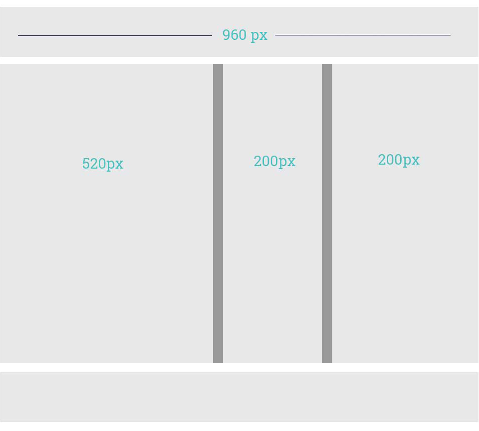
This is a grid system that scale based on user screen. It’s also called liquid layout grid. In fixed width layout the outer container is fixed and do not scale based on screen size. The elements within the container may or may not be defined percentage wise. 960 grid system is commonly used in fixed width layout.

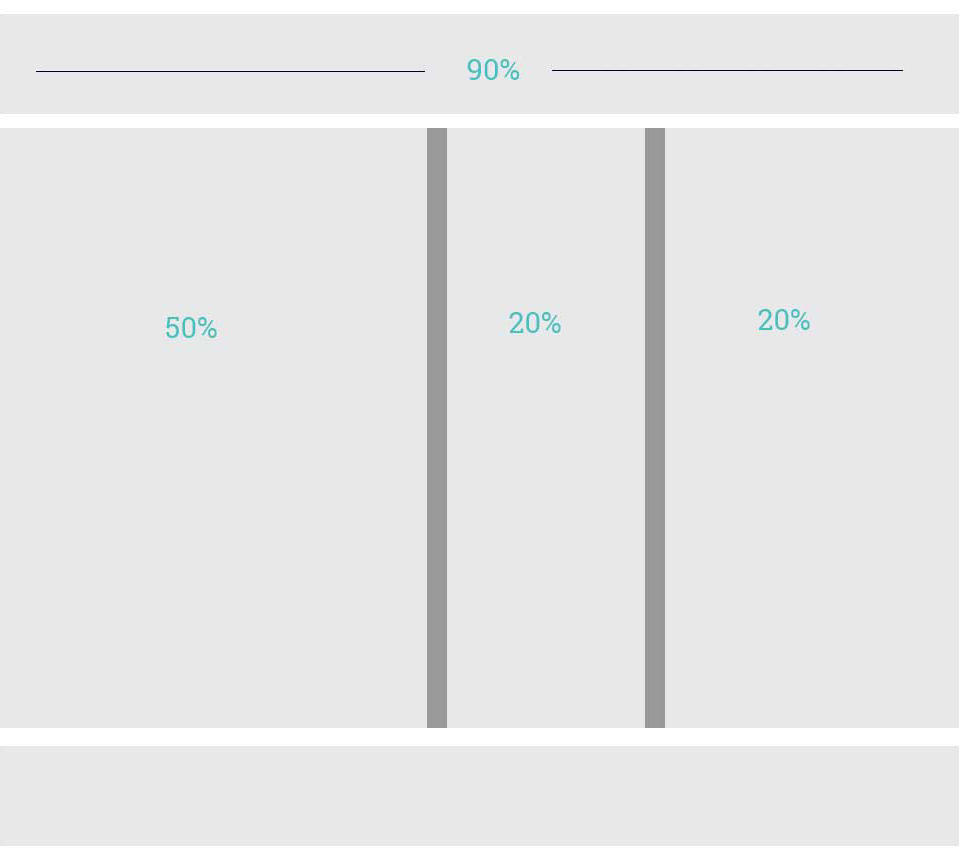
In fluid grids the outer container is defined percentage wise, hence it will scale based on the screen size. The inner elements are also defined percentage wise especially the images so that they can scale easily.

CSS Mediaqueries
With CSS Mediaqueries, you can define CSS specifically for a particular screen size. There will be instances where you cannot resize an element with fluid grid. You can define media queries in css like below
// For Mobile devices

@media screen and (max-width:667px){

// Your css for mobile devices goes here

}
// For Tablet devices

@media screen and (max-width:1024px){

// Your css for tablet devices goes here

}
Responsive images
Resizing images based on screen size is a challenging part. The key is to not define a fixed width and height for the images. Instead use the max width css property and set it to 100%.
This will make sure that the image is resized to 100% of the viewport if incase the image size is bigger than that of viewport.
If the image you are loading is larger than the screen size, then the load time is increased since larger image is loaded than the required size. Hence make sure that sizes and srcset image attributes are set for respective devices.
Benefits of Responsive web design
User experience
Users expect the website to fit perfectly on their mobile device. You need to have a proper strategy to implement it. E.g Datatables are really difficult to accommodate in mobile device and the user will tend to scroll a lot which will result in poor experience. You can display the data in form of graphs instead of tables to improve the user experience.
Reduce Cost
Developing a responsive website is much cheaper than developing a separate mobile website. Since same codebase can be used to make a desktop website to look better in mobile using fluid grids, cost and time of development is drastically reduced.
SEO
Most of the search engines consider responsive web design as a parameter for better ranking. So it is not a choice but a necessity. By having separate websites for desktop and mobile, may lead to duplication of content which can result in penalising your website.
Speed
Mobile users expect the website to load faster. A study reveals that users accessing the website from mobile tend to abandon the web page if it takes more than 3 seconds to load. So you need to optimise your webpages to mobile and do not load unnecessary scripts and elements which take more time to load.
Responsive web design frameworks
Developing a responsive framework from scratch can be overwhelming. Below are couple of famous frameworks which you can use to develop your websites.
Twitter Bootstrap
Bootstrap is an open source framework built by Twitter which is developed with mobile first approach.
Bootstrap uses series of containers, rows and columns to make its layouts flexible. You can read more about the approach here

Zurb Foundation
Zurb foundation is another frontend responsive framework which provides out of box mobile first and responsive email template grids. It is semantic, flexible and easily customisable framework. You can read more about it here

Books for further reading
Conclusion
As the number of mobile devices continues to grow day by day by various vendors, the traffic from these devices also increases. Hence it is always recommended to make your website responsive so that you do not lose the traffic from these sources. Upgrade your old websites by using the recommended frameworks and you can also contact us for any help required in the process.


